
Aravind Ramalingam
- Front-End
- cards
- ChakraUI
Create Responsive Cards with ChakraUI
Cards can be tricky to create especially when there are images within it. In this post, we will see how to create responsive cards with the help of ChakraUI.
Introduction
Cards are everywhere, from personal website to E-commerce sites. Responsive cards can make or break your website.

Okay, how? Chakra UI makes it easy to get started especially for new developers as it provides most of the common components required for web development. Let's use cards to list down blogs articles.
Create Card
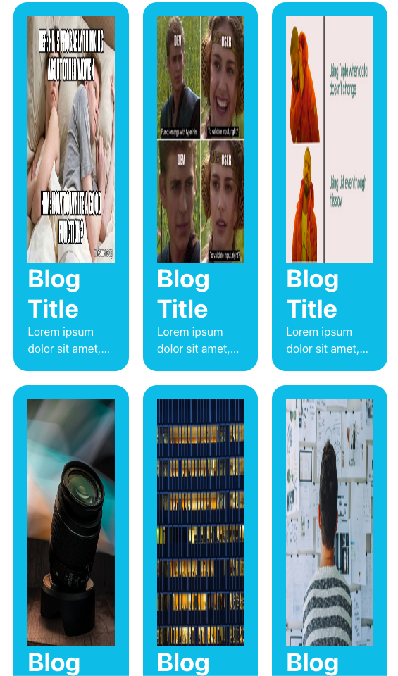
ChakraUI provides Box component which makes easier to create cards. The as property for the box is set as article to play nice with the search engines.
Set the image width to 100% so that it takes the entire width of the Box. For now, we can provide a fixed value for the height of the image, this determines the height of the box. Modify the box with properties such as borderWidth & borderRadius.
const Card = ({ img }) => {
  return (
    <Box  p={5} bg="cyan.400"  borderRadius={20} as="article">
    <Image h="350px" objectFit='fill' w="100%" src={img} alt="stock image"/>
   <Heading size="xl" fontWeight="bold"> Blog Title </Heading>
   <Text noOfLines={2}> Lorem ipsum dolor sit amet, consectetur adipiscing elit. Suspendisse elementum urna quam. Aenean risus turpis, aliquet id diam et, lobortis pellentesque ex. Nulla facilisi. Maecenas. </Text>
    </Box>
)

Stacked Cards
SimpleGrid component is one of the many components provided by ChakraUI to stack items together. We can set the number of cards per row using the property columns. We will go with 3 cards per row.
const CardLayout = ({ imgs}) => {
  return (
    <SimpleGrid columns={3} spacing={5}>
      {imgs.map((img, index) => <Card key={index} img={img}/>)}
    </SimpleGrid>
  )
}

Responsive Layout
The 3 column layout does not scale well across the devices. By passing an array of values to the columns property we can make the layout responsive for all the devices. How easy was that?
const CardResponsive = ({ imgs}) => {
  return (
    <SimpleGrid columns={[1,2,3]} spacing={5}>
      {imgs.map((img, index) => <Card key={index} img={img}/>)}
    </SimpleGrid>
  )
}

Fixed image height does seem to work across devices, so we will use useBreakpointValue hook to fix it inside the Card component. useBreakpointValue hook from ChakraUI is very powerful, it returns different value based on the device.
const h = useBreakpointValue({base: '350px', md: '350px', xl: '300px'})
Takeaway
ChakraUI provides many similar components, knowing when to use what will take some time, but getting started for new developers is easier now. If you like this post then follow me on Twitter for similar ones. Happy New Year!