
Aravind Ramalingam
- Front-End
- ChakraUI
- Navigation Bar
- Responsive
Create a Responsive Navigation Bar using ChakraUI

Introduction
We all know how crucial the navigation bar is for websites. But most websites don't have a good one. Why? Because responsive design for navigation bar is not easy.
How is the navigation bar different?
Usually, when we build a responsive layout using ChakraUI, the common approach is to stack the components horizontally for larger devices & vertically for smaller ones. This approach does not work for navigation bar. A typical navigation bar has the following components:
- Logo
- Navigation menu
- Call-to-action buttons
| Desktop | Mobile |
|---|---|
 | 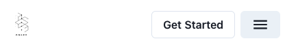 |
Based on the device type, we need to rearrange the items. We will see how to build the above navigation bar in 3 steps:
- Build desktop version
- Build mobile version
- Make it responsive
Build desktop version
The desktop version is easy to follow. Wrap all the elements inside a Flex with justify property value as "space-between". To get even spacing between navigation bar items, we will list them inside a HStack component.
Build mobile version
- ChakraUI provides the Drawer component, which is a panel that slides out from the edge of the screen. We can place all the navigation items inside the body of the drawer for the mobile version.
- We will use the useRef react hook to communicate between the menu icon and drawer. If you don't about this hook or need to refresh your memory then checkout the post React useRef Guide by Dmitri Pavlutin.
- Finally, we can add the
MobileDrawercomponent next to the CTA button inside theheader.jsfile.
| Navigation Menu | Navigation Menu - Expanded |
|---|---|
 | 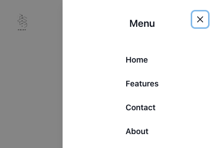 |
Make it responsive
| Desktop | Mobile |
|---|---|
| 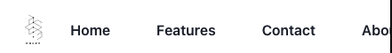 |
All the hard parts are over. Now we just have to hide certain components based on the screen size. Thanks to ChakraUI it's easier than ever by using the display property.
- Hide the
MobileDrawercomponent in the Desktop version by addingdisplay={{ base: "flex", md: "none" }}to theFlexcomponent inside it. - Hide the Navigation Items listed inside
HStackcomponent in the mobile version by addingdisplay={{ base: "none", md: "flex" }}.
Final Desktop Version:
Final Mobile Version:
| Navigation Menu | Navigation Menu - Expanded |
|---|---|
| |
Conclusion
Navigation bar is one of those things which look scary to get started, but once you find a good example, it's not that hard to build. Hope you found this post to be useful. For more such posts, follow/DM me via Twitter